
Most founders who come to me want to start with the logo. I understand why. It's the fun part, it's the visible part, and it feels like progress. But a logo designed before the brand has a position is a costume without an occasion. It might look great. It won't feel right. And you'll find out it doesn't fit at exactly the wrong moment: in front of an investor, a hire, or a customer you can't afford to lose.
So the logo is the last thing I design. Here's what has to exist first.
Strategy before anything visual
A brand is a position: who you're for, what you displace, what people need to feel when they meet you. Your voice is that position made audible. It's the personality and tone of everything you say, from a deck to a support reply, and it decides whether you come across as the serious, capable company you are or as a startup still finding its feet.
Design is the expression of that position, not a substitute for it. A quirky voice can carry a bright, playful mark. An authoritative voice needs restraint and precision. Without the voice defined, every visual decision is a guess, and guesses look inconsistent the moment more than one person is producing work.
This is why every flagship project I take on starts from professional brand strategy, written by you or by strategists I trust, before I draw anything. It isn't gatekeeping. It's the single biggest predictor of whether the project works.
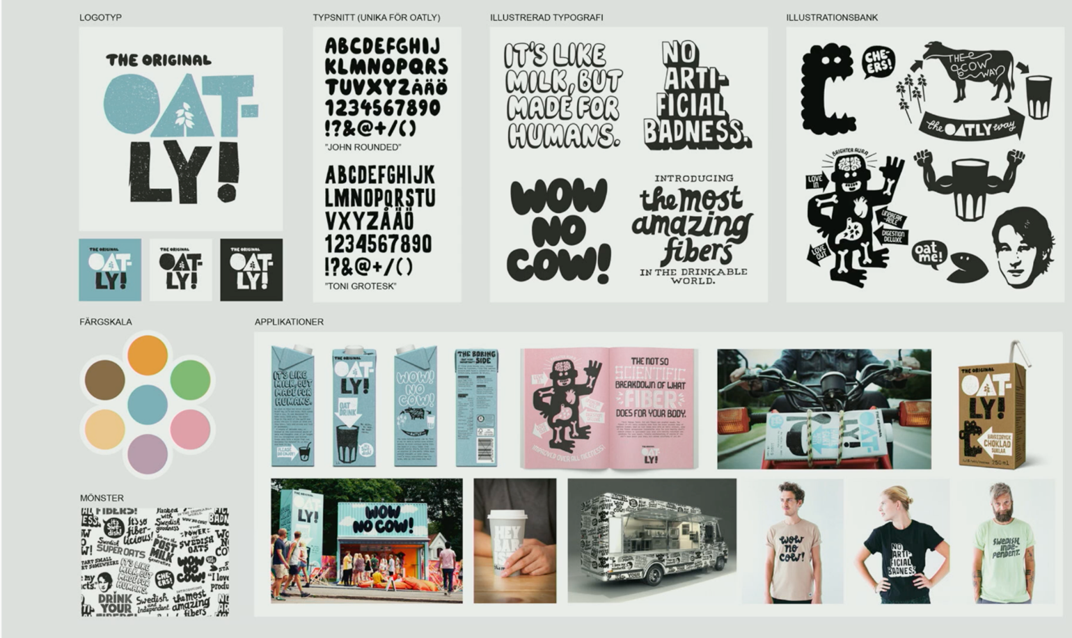
Three brands built voice-first
Oatly is cheeky, self-aware and relentlessly conversational, and the voice came first. The hand-drawn type, the packaging covered in jokes, the deliberately unslick layouts all exist to carry that tone. The design would be baffling without the voice. With it, it's one of the most recognisable brands in grocery.
Liquid Death decided to sell water with the attitude of a death-metal band, and then designed accordingly. The logo looks like a band insignia, the product names are jokes, the merch looks like tour shirts. Every visual decision is downstream of one loud, consistent position.
Glossier went the other way: intimate, aspirational, real. The clean wordmark and soft palette don't shout, because the voice doesn't. The look and the tone are the same idea in two media.
None of these started with a logo brief. They started with a point of view, and the design followed it.
What "defining your voice" actually means
Know who you're speaking to and what they need to believe. Be clear about what you stand for, in words you'd be comfortable saying out loud. Decide what kind of person the brand would be if it walked into a room. Turn that into a handful of tone traits, with examples, phrases you use, phrases you never use, and how the tone flexes between a sales deck and a bad-news email. Then write it down, because a voice that lives in the founder's head doesn't survive the fifth hire.
If you have this, I can design you a brand that feels inevitable. If you don't, I'll point you to people who can help you build it, and we'll start when it's ready.
The logo connection
Once the position and voice exist, the logo almost designs itself. The type has a reason to be geometric or humanist. The colour has a reason to be loud or quiet. The mark has a reason to exist at all. That's the difference between a logo that's merely beautiful and one that's yours.
Projects fail on weak foundations. Yours won't.