

.png)
At Panthera Designs, we live for a good rebrand -- especially one that’s done right.
And Wise? They nailed it.
When a company refreshes its visual identity, it should feel like a natural evolution, not a forced facelift. Wise’s new branding, crafted by Ragged Edge, is the perfect example of a design overhaul that not only looks fresh but also reinforces the brand’s mission in a way that’s deeply intentional.
Why This Rebrand Works So Well …
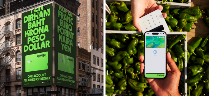
Wise has always been about breaking barriers in finance, making cross-border payments seamless for individuals and businesses worldwide. But their previous brand identity didn’t quite match their global impact. Enter the 2024 rebrand -- where every design decision speaks to their commitment to serving “the world’s money” across 170+countries and 146 languages.
Take the close-up tour on their new look (it’s bold, clean, and green!), then … Let’s break down why we love this rebrand from both a design and branding perspective.
A Color Shift That Means Something.
First, that green. It’s not just a bold color choice -- it’s a statement. In an industry saturated with cold blues and greys, Wise stands out by using a vibrant green that conveys energy, movement, and financial growth. This isn’t just about aesthetics; it’s about making Wise visually distinct from traditional banking institutions while reinforcing its mission of financial empowerment.
Typography That Speaks to the World.
One of the most exciting elements of this redesign is the headline typeface, inspired by scripts from around the world. This is a smart, meaningful move -- branding isn’t just about looking good; it’s about being understood. By embracing global typography influences, Wise reinforces its commitment to serving a diverse, international audience. It’s not just about transactions; it’s about connection.
As Ragged Edge describes, this approach makes Wise’s brand “for everyone, everywhere.” And we couldn’t agree more.
.avif)
.jpg)
The Fast Flag Gets Even Sharper …
Wise’s Fast Flag icon -- a core part of their visual identity -- got a refresh, making it bolder and more legible. This tweak might seem small, but it matters. When you’re working with branding that needs to be instantly recognizable across digital and physical spaces, clarity is everything. And Wise ensures that no matter where you see the Fast Flag, you know exactly who it belongs to.
A Visual Identity That’s Actually Accessible.
A brand is only as powerful as the people who can connect with it. Wise’s updated design system prioritizes accessibility, ensuring that their visuals, typography, and colors are optimized for digital and real-world experiences alike.
According to Ragged Edge, the new design supports over 146 languages and meets top accessibility standards, reinforcing the idea that Wise is a brand that truly belongs to the world.
.png)
.png)
Why This Matters for Branding as a Whole …
As designers, we appreciate when a rebrand isn’t just for the sake of change but serves a real strategic purpose. Wise’s new look tells a story of financial freedom, global inclusivity, and effortless transactions -- all through the power of smart design choices.
This is what great branding does: it visually amplifies a company’s mission and values without needing a single word of explanation. Wise has achieved this with an identity that feels fresh, meaningful, and instantly recognizable.
The Takeaway: Be Intentional with Your Brand.
Wise’s rebrand isn’t just a pretty update -- it’s a masterclass in branding done right. It’s proof that every design decision, from color choices to typography to iconography, should be rooted in meaning.
If you’re thinking about refreshing your brand, take a page from Wise’s playbook: be bold, be intentional, and make sure every design choice tells your story.
Need a Rebrand That’s Just as Smashing?
Your brand deserves to be as powerful as your business. Whether you're just starting out or ready for a fresh new look, Panthera Designs is here to create branding that makes an impact. Let’s design something iconic together. Get in touch today!
.png)
.png)
.png)
.png)
.png)
.png)

.png)
.png)
.png)